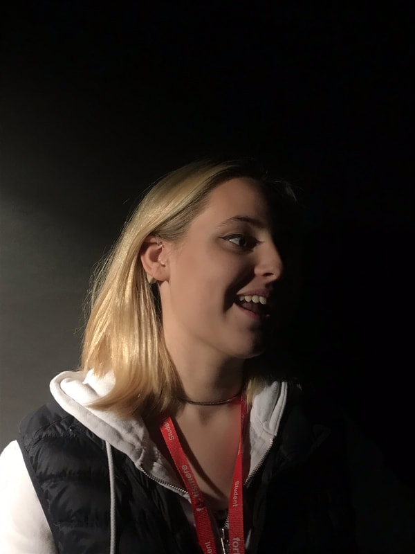
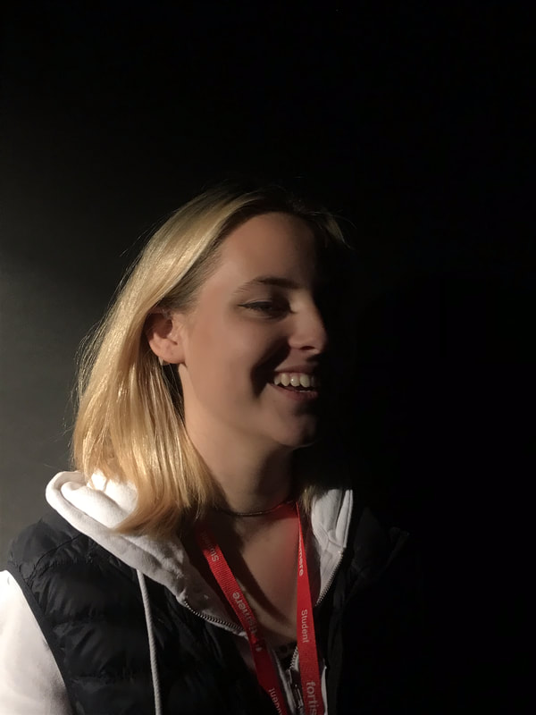
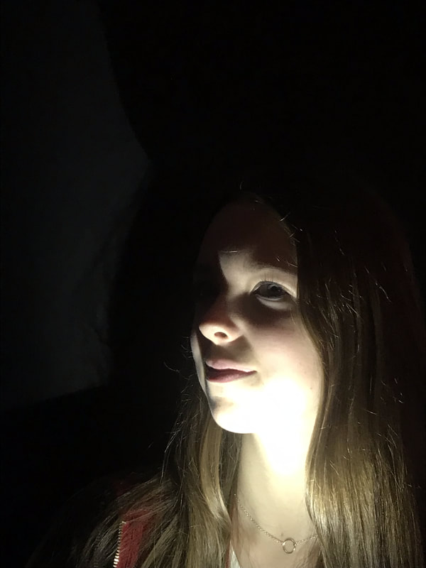
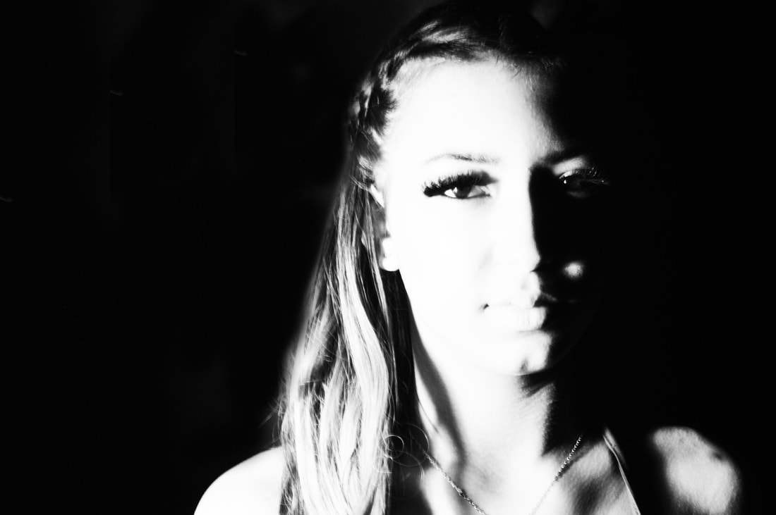
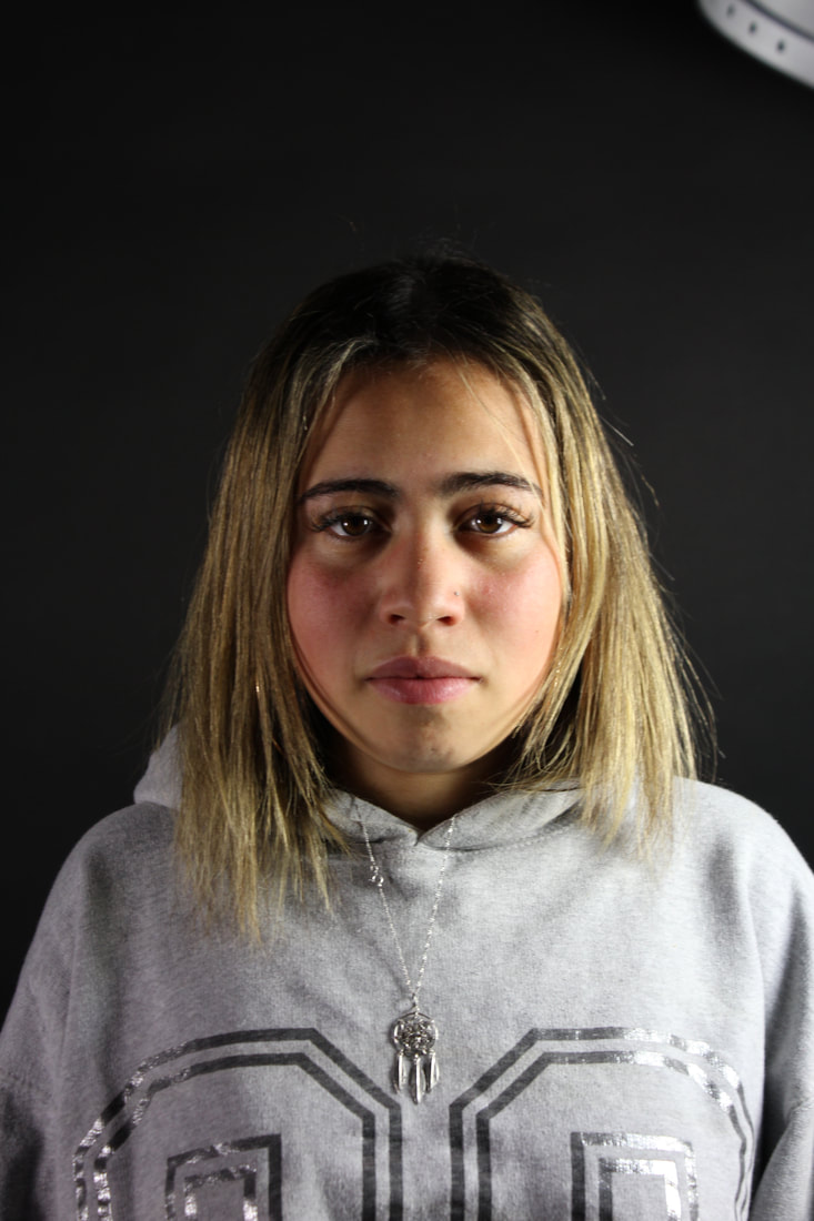
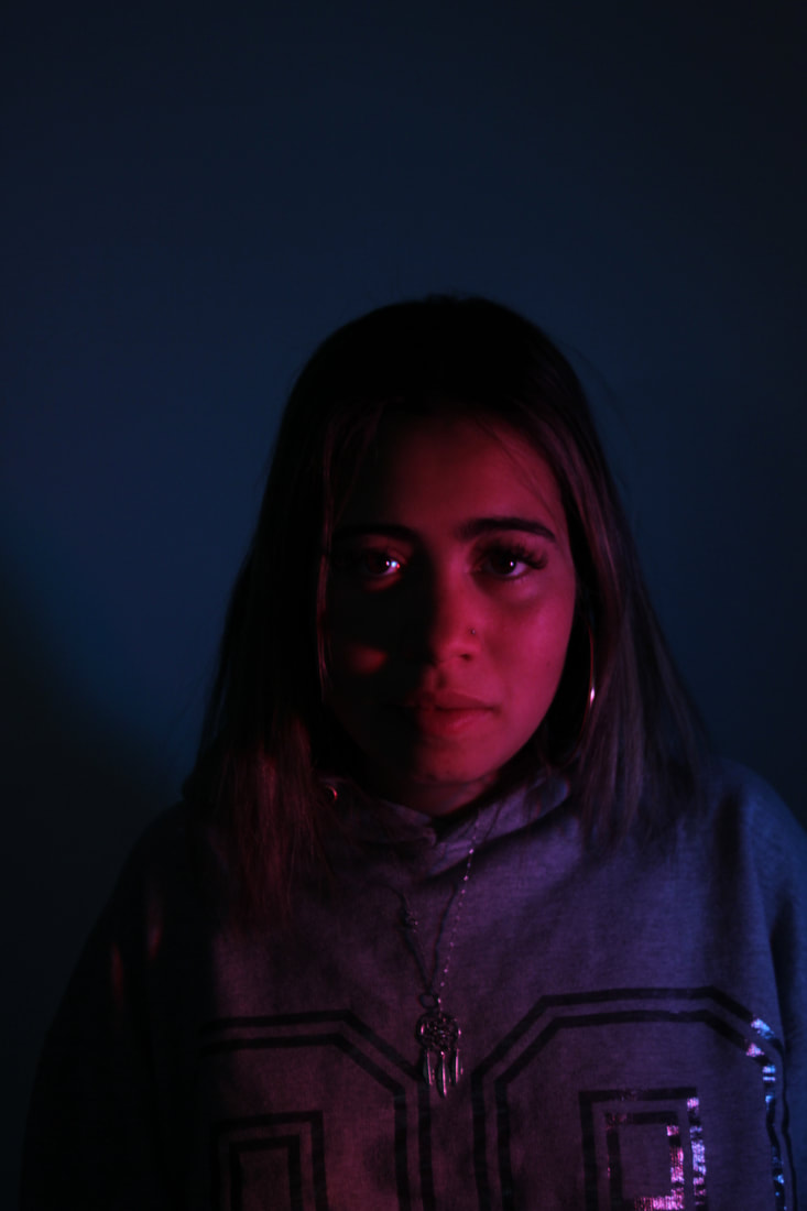
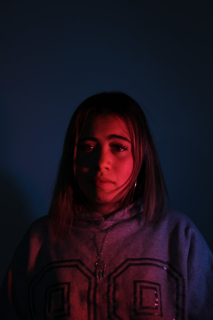
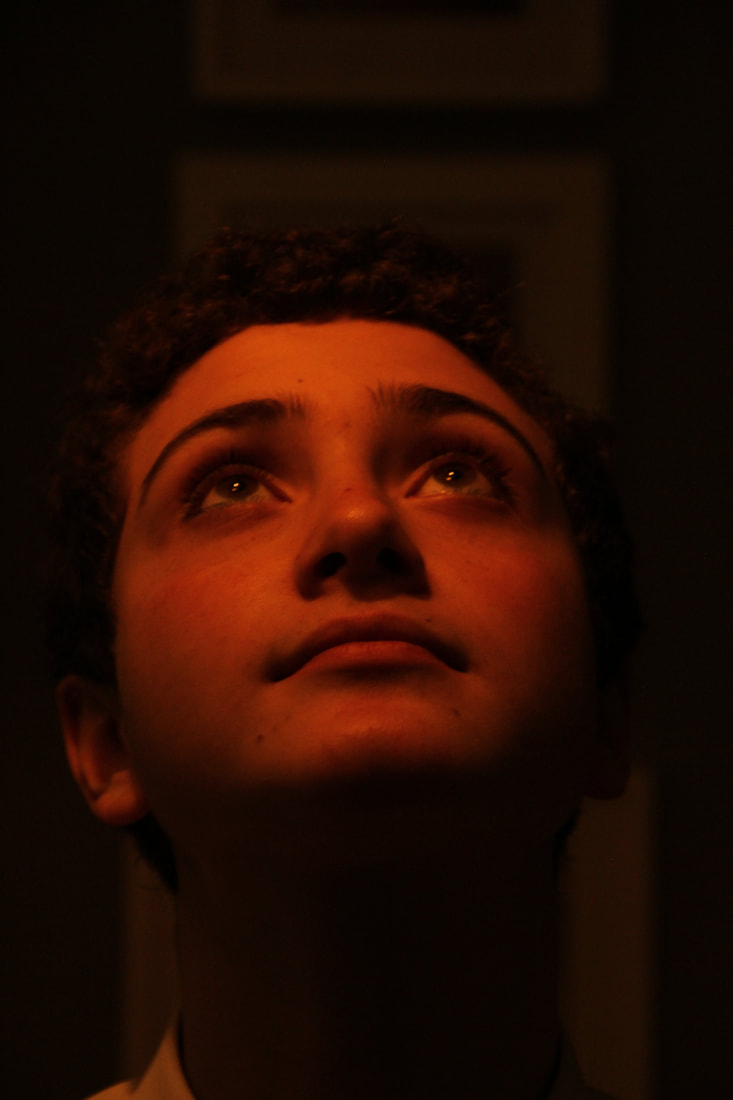
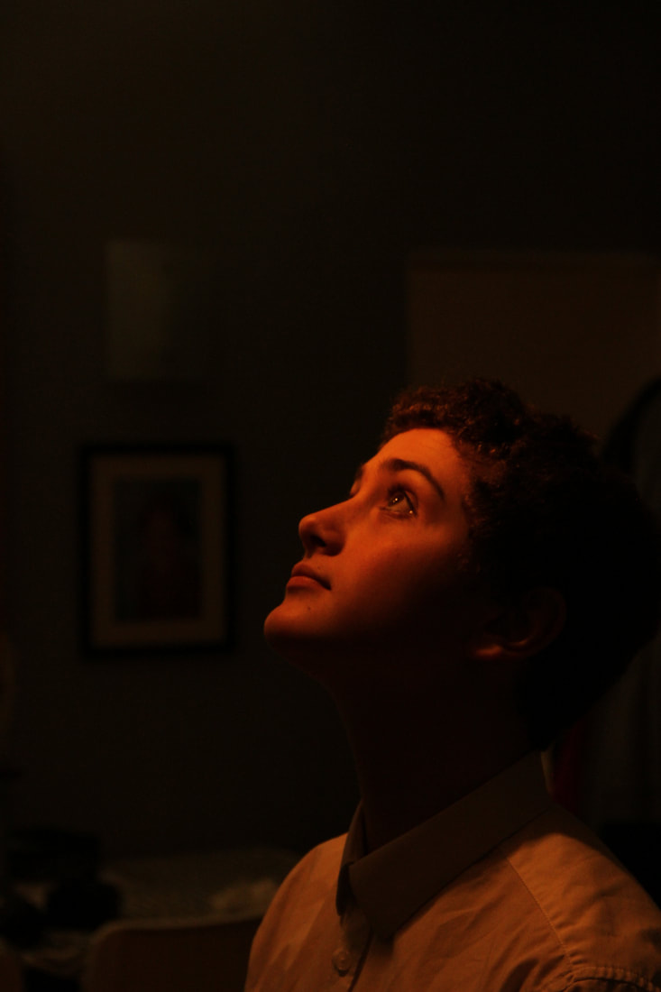
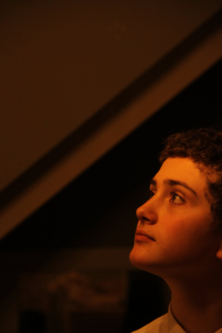
The selfie.
The first selfie.

|

|
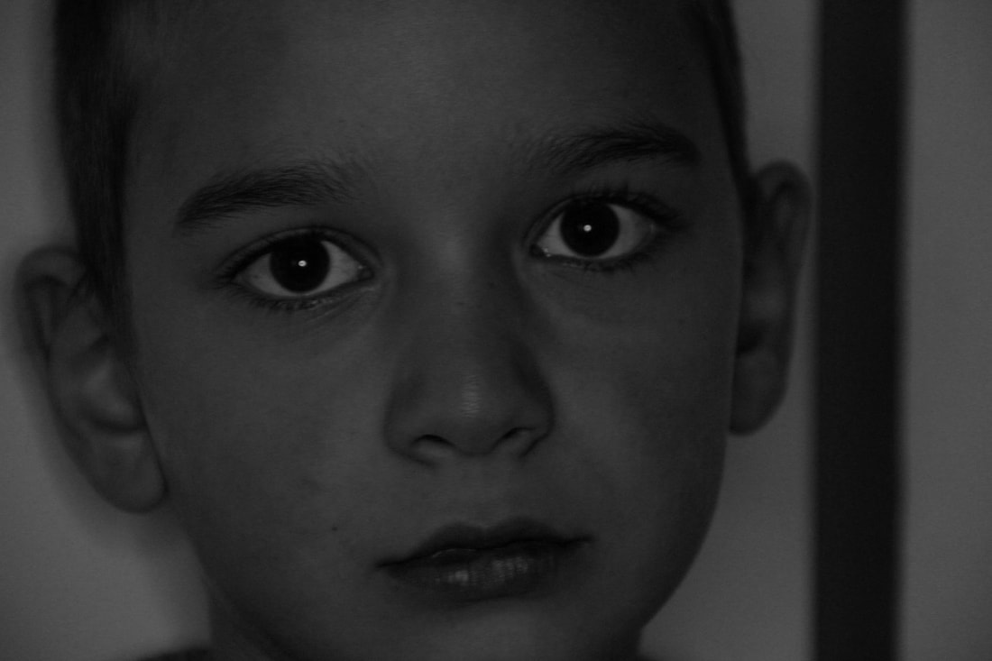
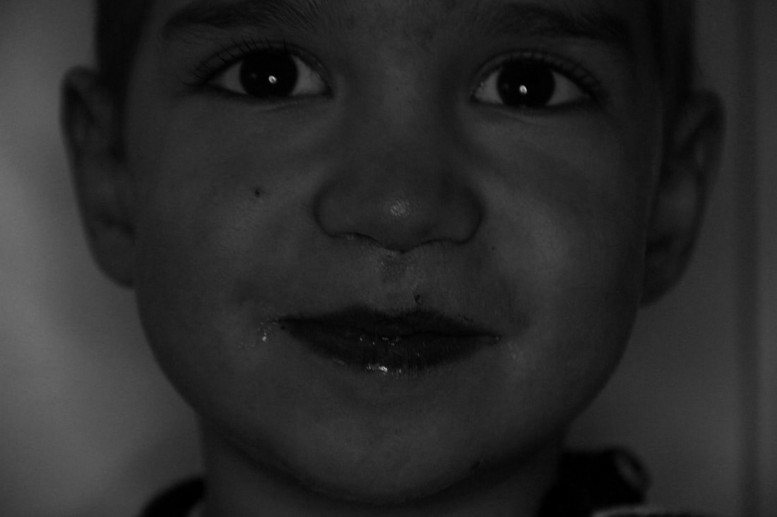
In 1839, Robert Cornelius, an American pioneer in photography, produced a daguerreotype of himself which ended up as one of the first photographs of a person. This image differs from the modern day selfie that is used by a large proportion of our generation. The selfie that we know and use today is seen of more of a disposable image that holds less value than it would've in the 19th century as our selfies are produced after the click of a button instead of putting a lot more effort in the whole process and it taking a lot longer. The modern day selfie is instantaneous.
I take many selfies a week as my main use for them is to communicate with my friends. I take them in the form of a snapchat which acts a message is is mainly how i have conversations with my friends. I rarely take selfies with the intention to post them on other social media platforms but if i did, i would post them on instagram. the difference between the two is that my selfies on snapchat are non permanent and disappear once the other person has viewed it. The instagram selfies are permanent and any of my followers can see it at any time.
I think selfies have become more popular because they allow us to express our creativity and originality. It is also a way to receive gratification if you think you look good, you'd want to share it to other people and show them how good you look. There can be a downside to taking and sharing selfies as the internet can be a dangerous place and once you've posted an image on the internet some can screenshot and share your selfie elsewhere.
I think selfies have become more popular because they allow us to express our creativity and originality. It is also a way to receive gratification if you think you look good, you'd want to share it to other people and show them how good you look. There can be a downside to taking and sharing selfies as the internet can be a dangerous place and once you've posted an image on the internet some can screenshot and share your selfie elsewhere.
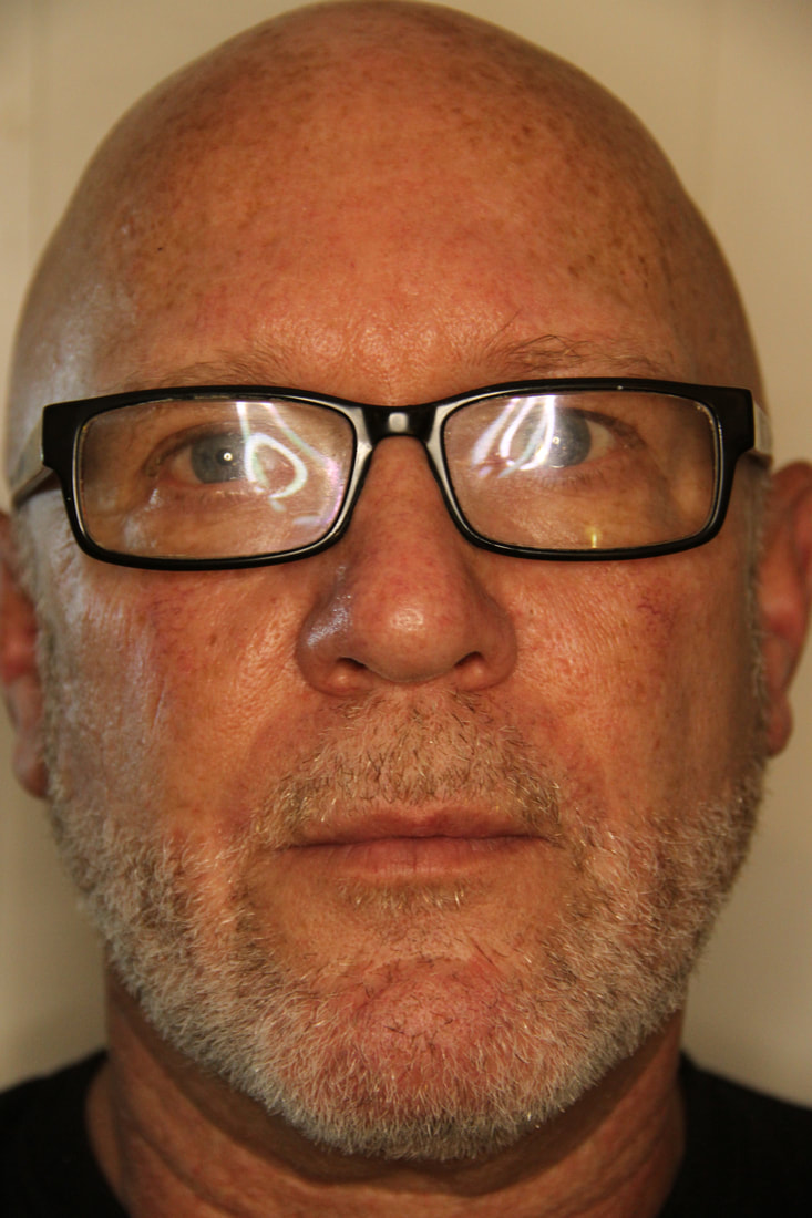
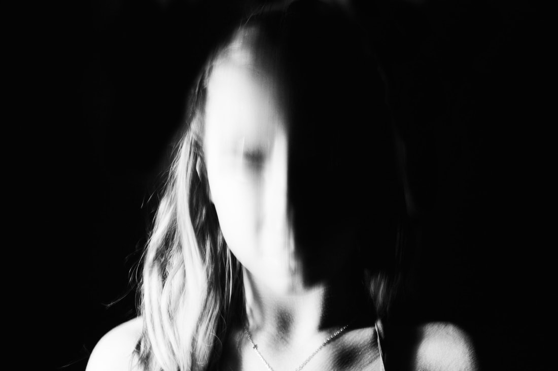
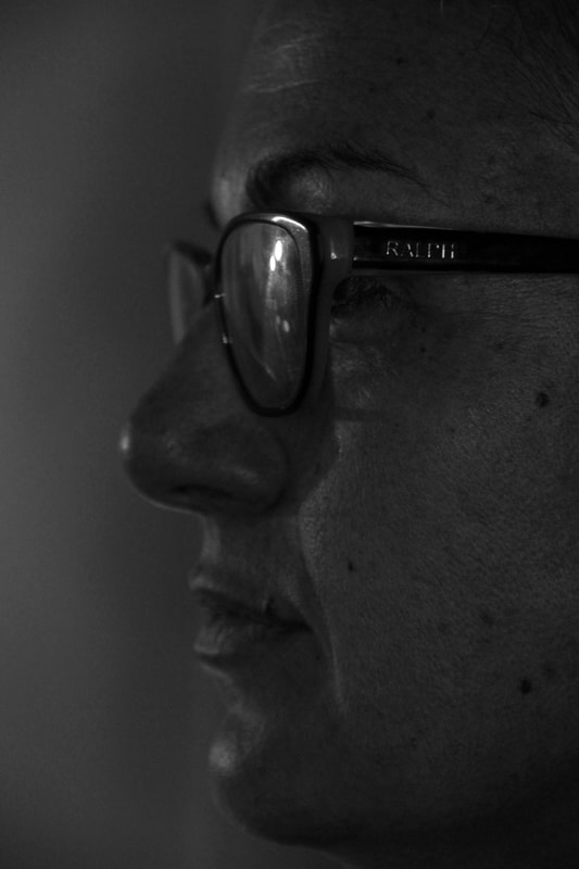
The reflected selfie
Contextual study- Isle Bing
|
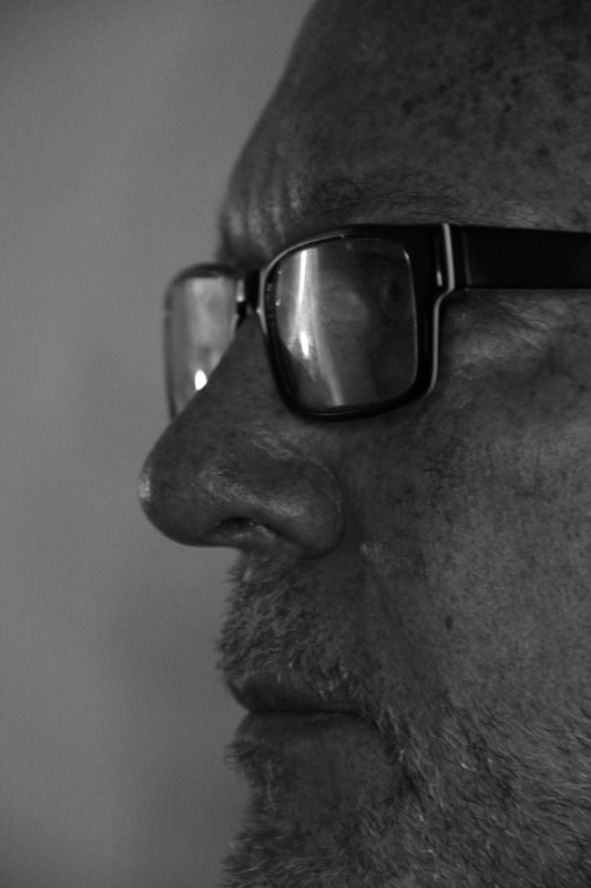
Bing began her career as a photojournalist in Frankfurt. In 1930, inspired by the work of Paris-based photographer Florence Henri, she packed up and moved to the French capital. Bing’s career flourished there. One of her best known photographs, a self-portrait taken in a mirror. I have chosen to look at Ilse Bing’s reflected self-portrait in more depth. I was inspired by the double reflection using two mirrors. It provides two different perspectives using the same single photograph. It incorporates her side and front profile, giving nearly a 360-degree view of her face. Furthermore, the two different angles of her face appear to be presenting two different facial expressions; the side profile is quite serious and more intense, and the front profile is more relaxed and calming. The image itself is quite mundane and candid as there is not much posing and is set in an ordinary and natural everyday setting.
|

|
My photographs.
|
In my opinion, the first image was my most successful image out of my reflected selfies. This is because i feel it was the most creative and incorporated some elements from the image i looked at by Isle Bing. The double perspective give the photograph a more interesting touch and makes it more attention-grabbing. In addition, I also like how the photo reflected off the ladle turned out as there is something quite satisfying about the circular object and how it creates a fish-eye effect. I also find that the black and white affect added to the original photo makes it structured and cleaner to look at. The hardest part of this task was to find objects and surfaces to take the images on, however I think I was able to find and create some intriguing final images. I used two different cameras; an iPhone camera and a canon camera. I found that i prefer the photos created by the canon camera as it produces more professional looking photos and i feel it made the photos more balanced and proportional looking. Th black and white effect that i added to some of them give it a more crisp and dimensional look.


If i were to repeat this task i would definitely use the canon camera and incorporate a wider range of surfaces, maybe including outdoor surfaces such as shop windows or car windows. I would continue to use the black and white filter and repeat the circular surface to provide an enhanced perspective.
|


|
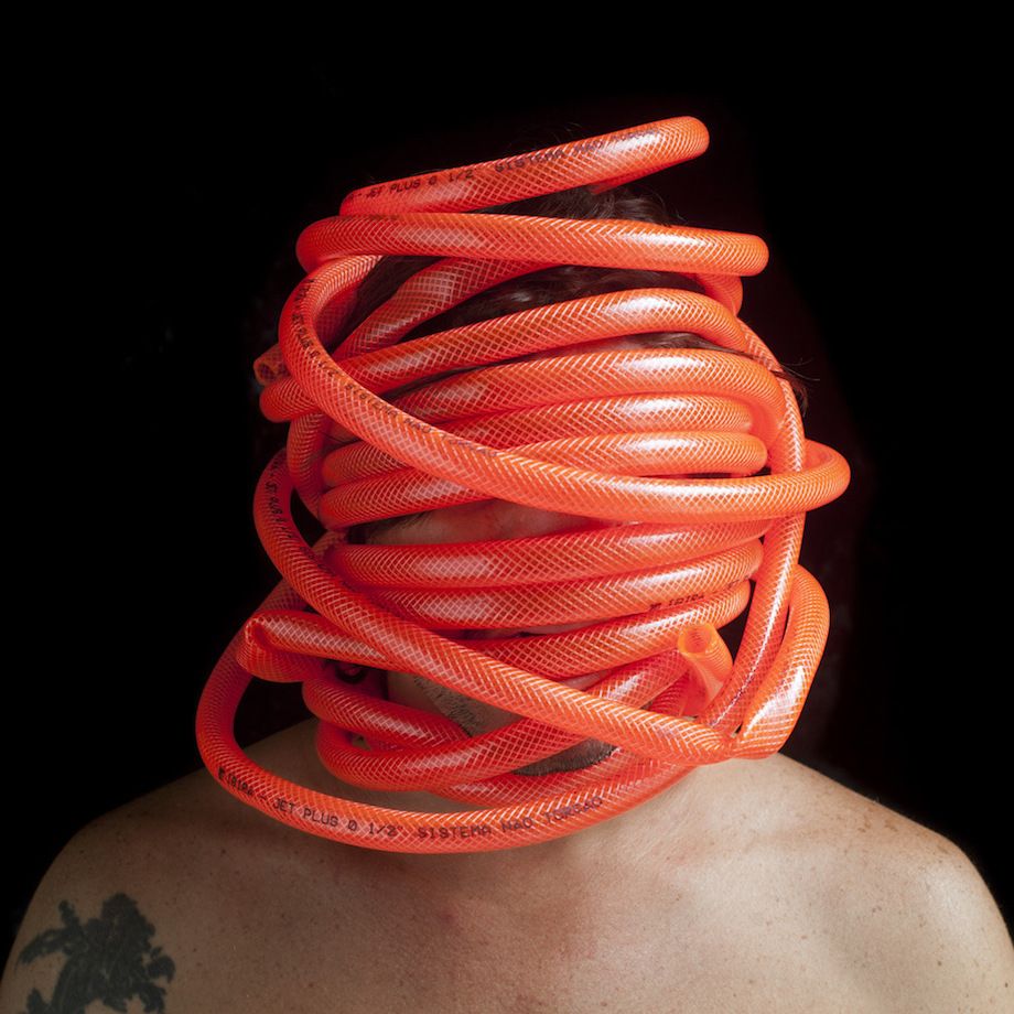
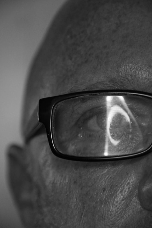
The obscured selfie
Contextual study- Edu Monteiro
Brazilian artist Edu Monteiro often puts himself into his own work, using his own body as part of the final work. He is known for his images that show a mask created of random objects that covers his entire face and his identity is hidden completely. He often uses organic materials, including animal body parts and tissues. I find his work very fascinating as its quite outside the box and you wouldn't normally encounter that with other more traditional portraiture photographers. They are captivating and make you want to look more as they include bright colours and odd, unusual objects and thats why they're engrossing to the viewer. The lack of symmetry and the irregularity of the placement of objects creates this sense of chaos, however this is contrasted with the bare and clean shoulders and the slick black background.
"My sensorial self-portraits are personal fictions. The impulse emerged from a sensory mask made by a Brazilian plastic artist Lygia Clark.With this impulse came the desire to try to manipulate and to wear an object that forced a change of sensations and self-analysis." - Edu Monteiro.
|
|
|
My photographs.
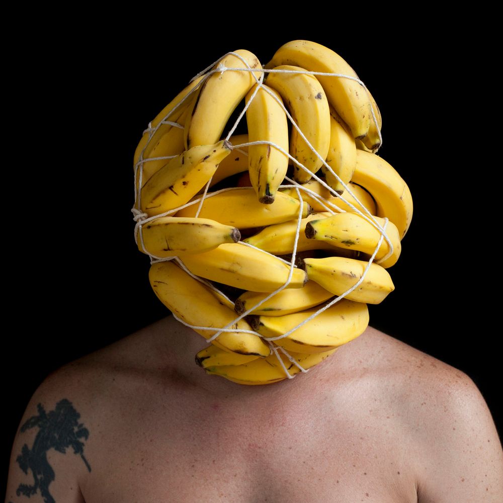
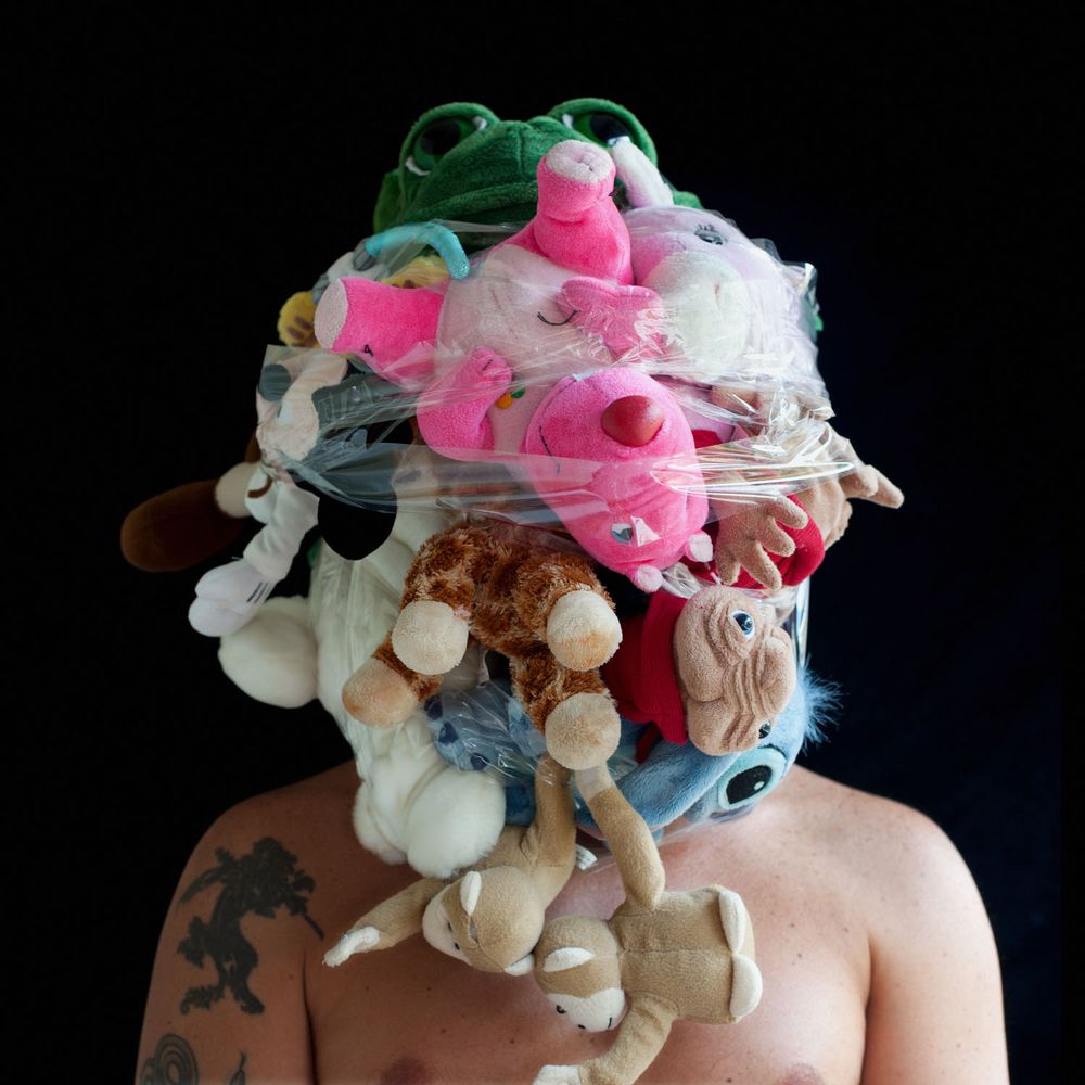
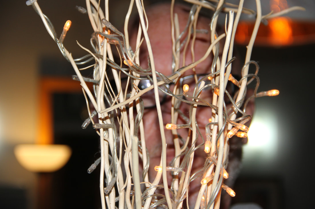
For me, this task was the most enjoyable and required me to be the most creative. I used my dad as a model and got him to pose with a variety of objects that would created the obscured images. This included fairy lights, cling film, circular objects and perfume bottles. My most successful image were the ones that i draped cling film over my dads face as it distorts the original image and adds texture to the image. I also found that the use of the circular tube object with the editing of the colouration was quite successful due the contrast in colour from the foreground and background and how it focuses on a segment of his face, concealing the rest of his face. Like Monteiro, I enjoyed using the bright colours where i could e.g. the oranges on the eyes, however I also enjoyed using the black and white filter for some of the other close up obscured images. I was inspired by the banana image by Edu Monteiro and chose to incorporate fruits to further obscure the portraits which I believe worked effectively. If i were to repeat this task and improve it, I'd try to use different mediums, for example water, to obscure the faces.


|


|


|
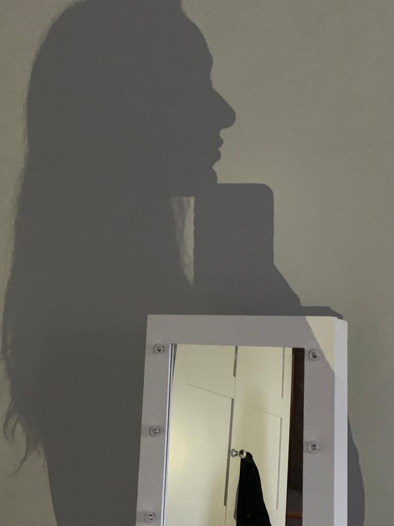
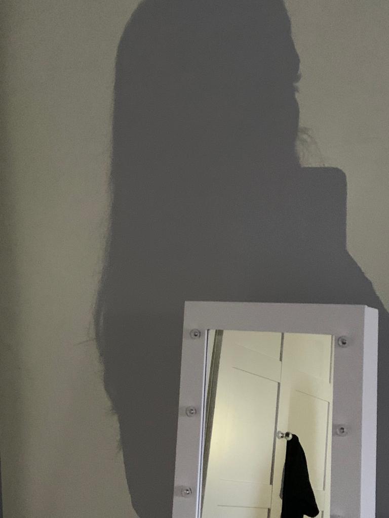
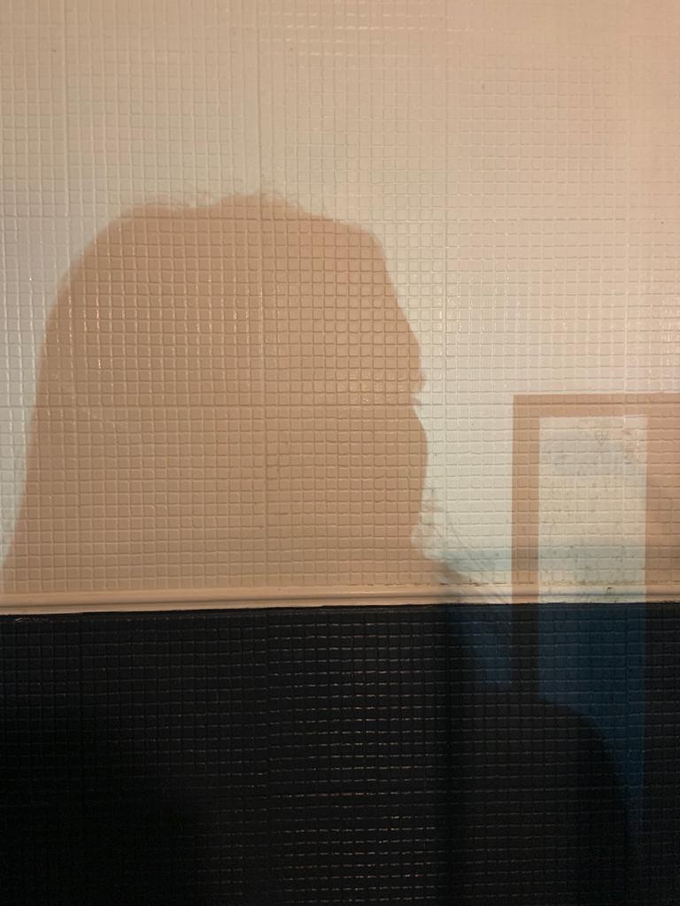
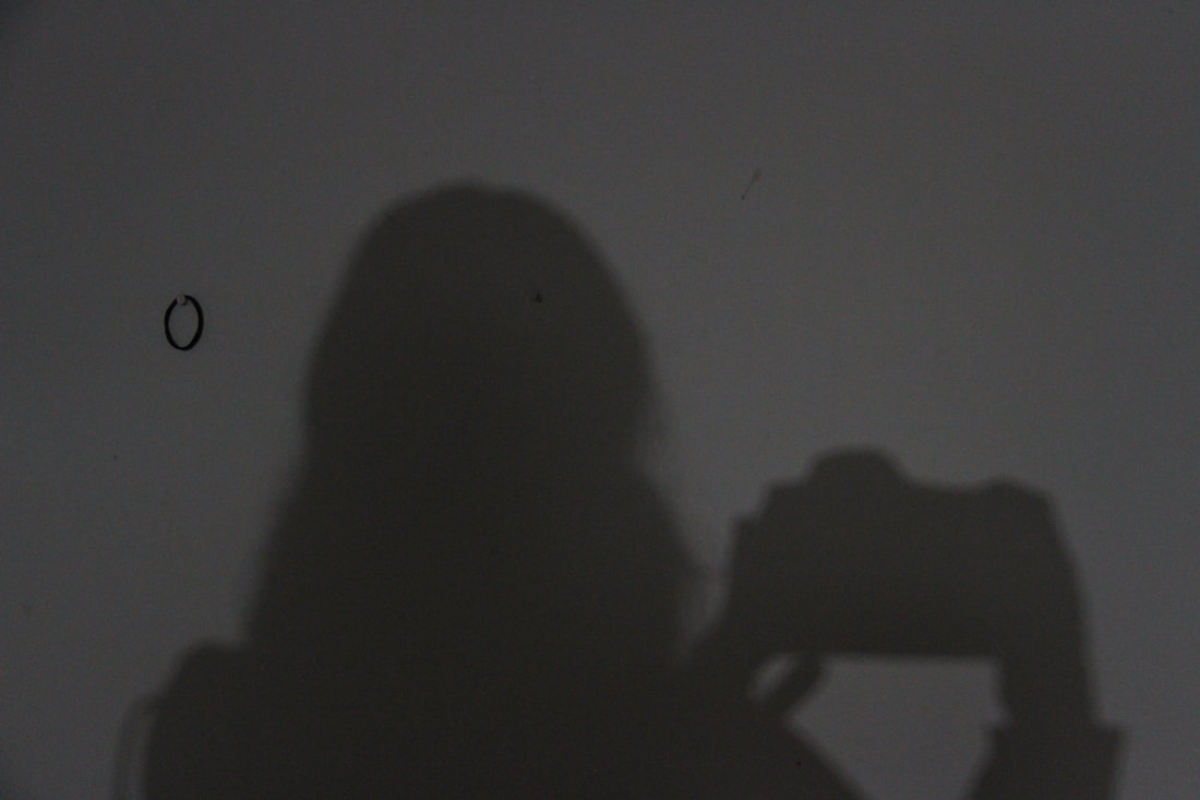
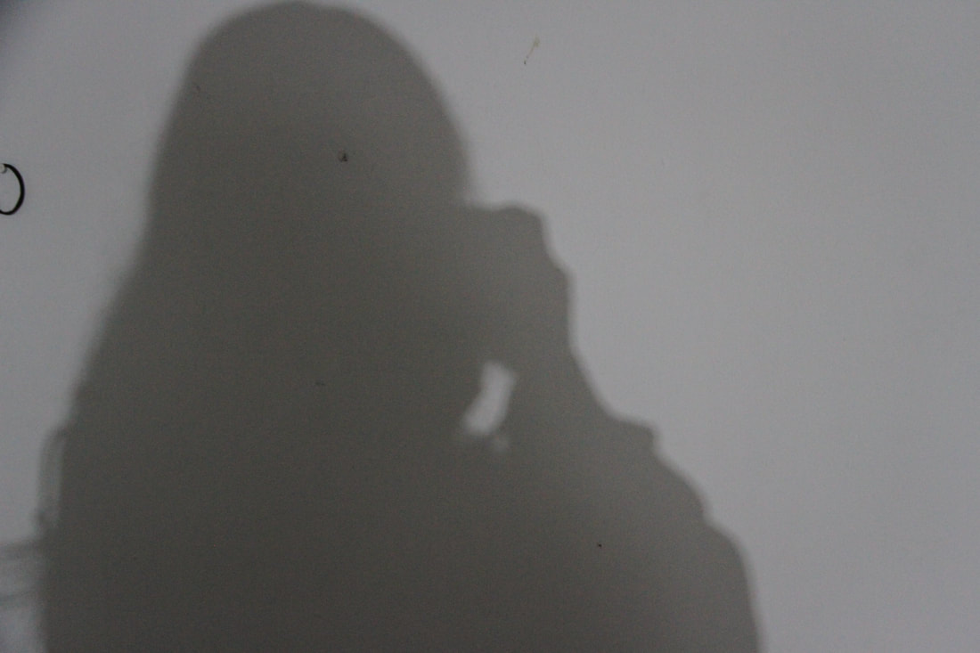
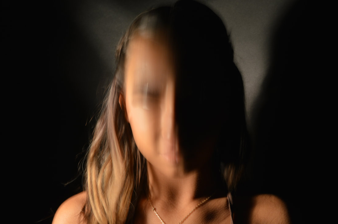
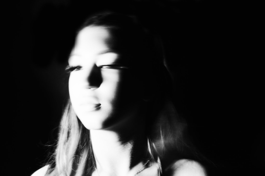
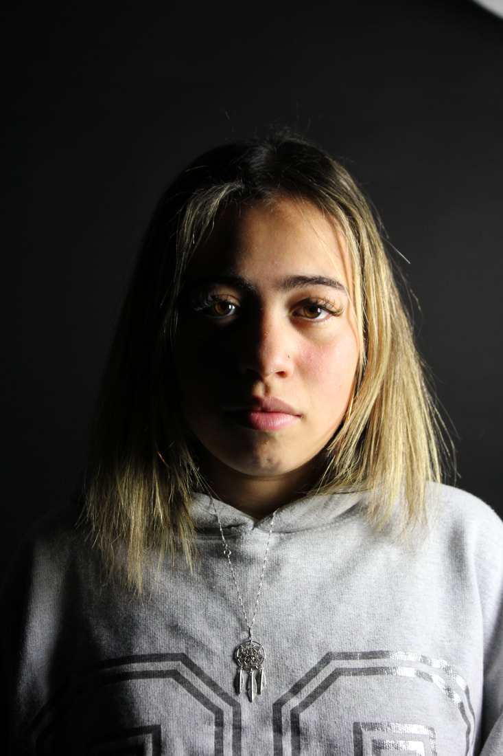
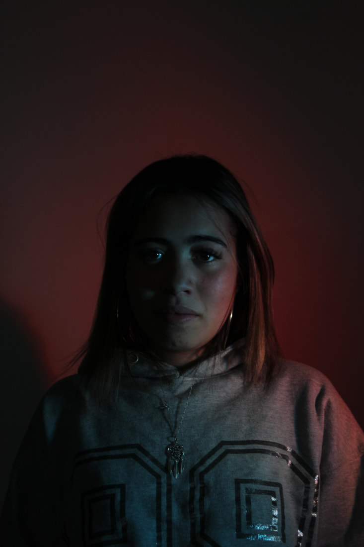
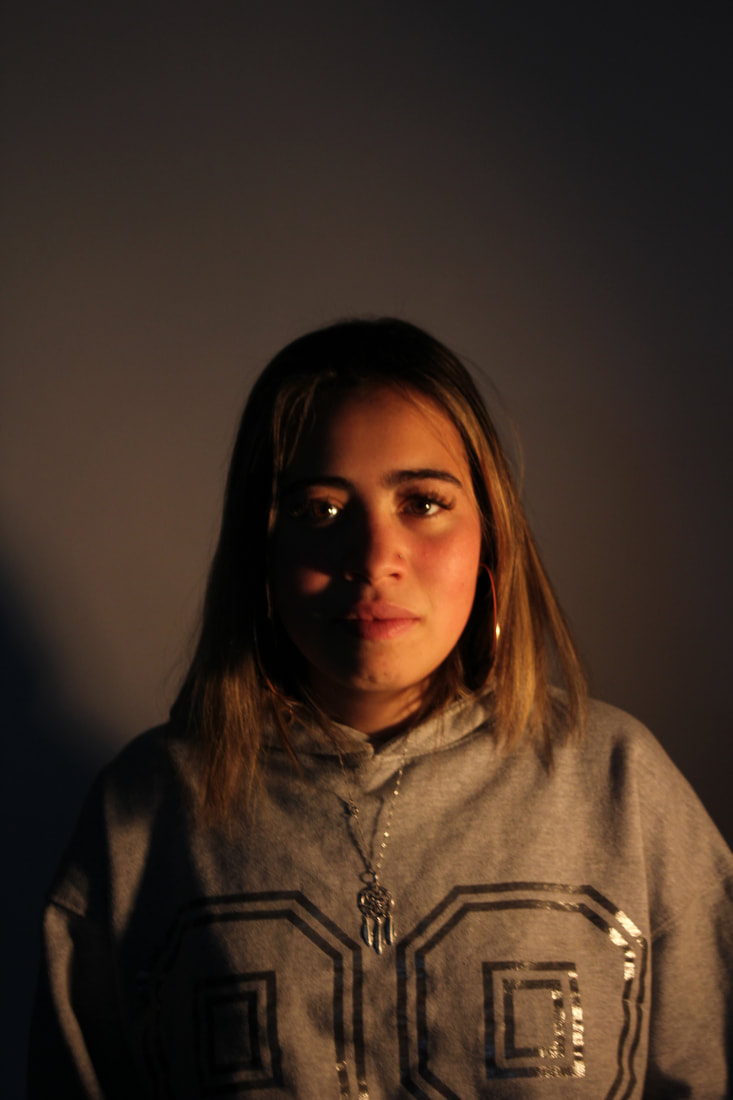
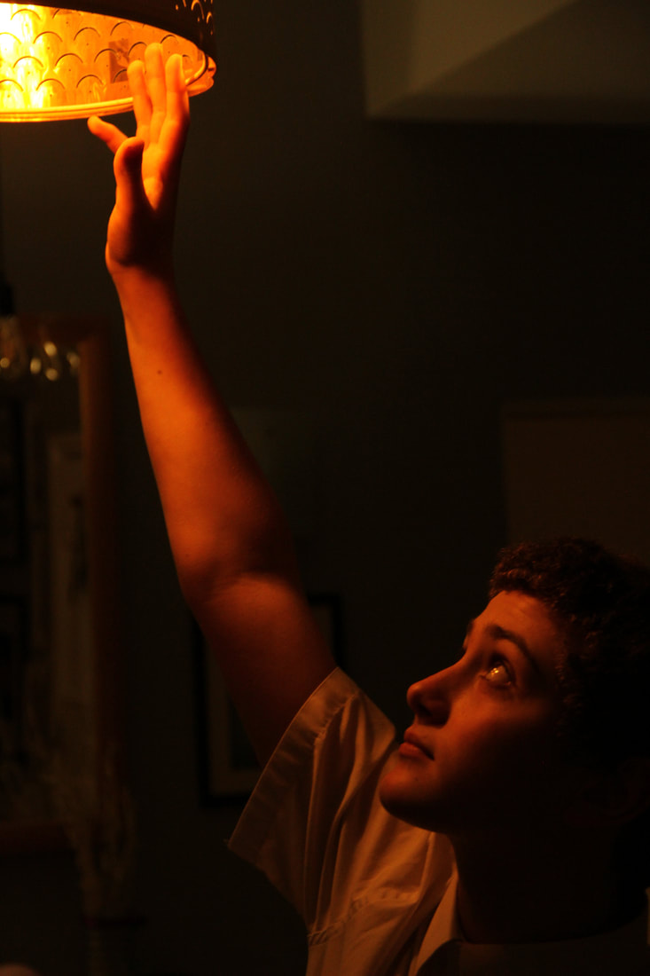
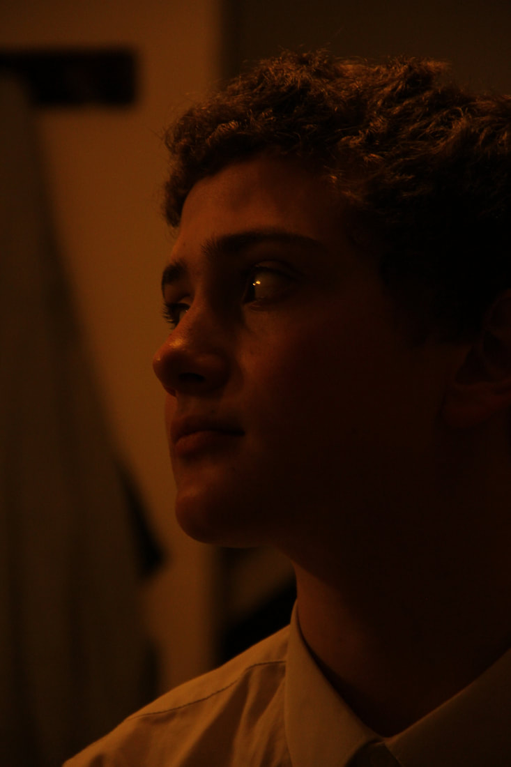
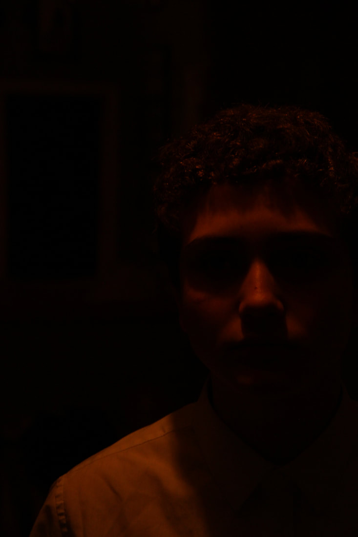
The shadow selfie.
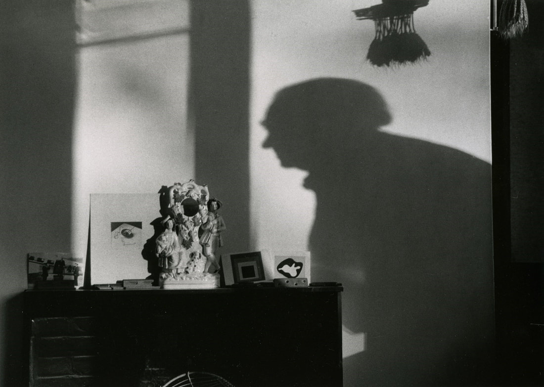
Contextual study- Andre Kertesz
Andre Kertesz is a Hungarian born photographer who emerged as one of the most influential practitioners of the medium. He was well known in Europe for his work of his distinctly dynamic compositions. He stated, “I just walk around, observing the subject from various angles until the picture elements arrange themselves into a composition that pleases my eye.” His work often involved shadows and capturing the basic outline of objects and people. André Kertész has been hailed as one of the most important photographers of the twentieth century. He aimed to capture the poetry of modern urban life. Today he is best known for his series of Polaroid studies of Washington Square Park.
"Everybody can look, but they don't necessarily see... I see a situation and i know thats right"- Andre Kertesz
"Everybody can look, but they don't necessarily see... I see a situation and i know thats right"- Andre Kertesz

|
|

|
My photographs.
This task was probably the most challenging to get a successful image due to the simplicity of the shadow and having to attempt to capture the crisp outline so you are able to make out the object, or in this case, person. I enjoyed the background of the tiles in my bathroom as it creates a more rustic look, however i believe that the most successful images were the ones taken with the grey background because of the more prominent outline of my body creating a cleaner look.

|


|


|
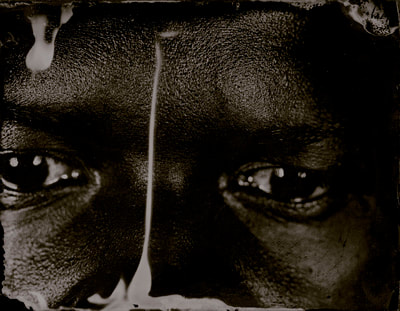
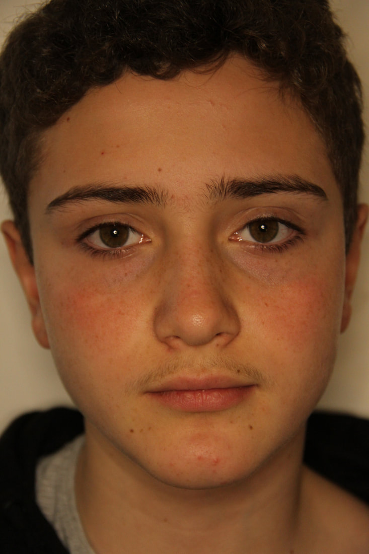
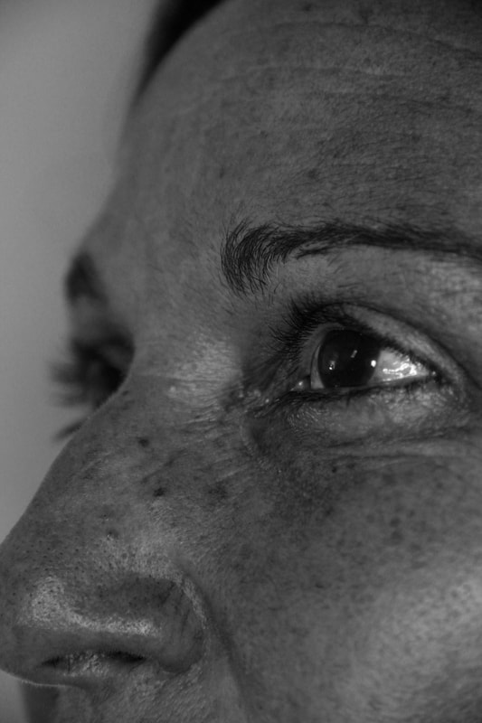
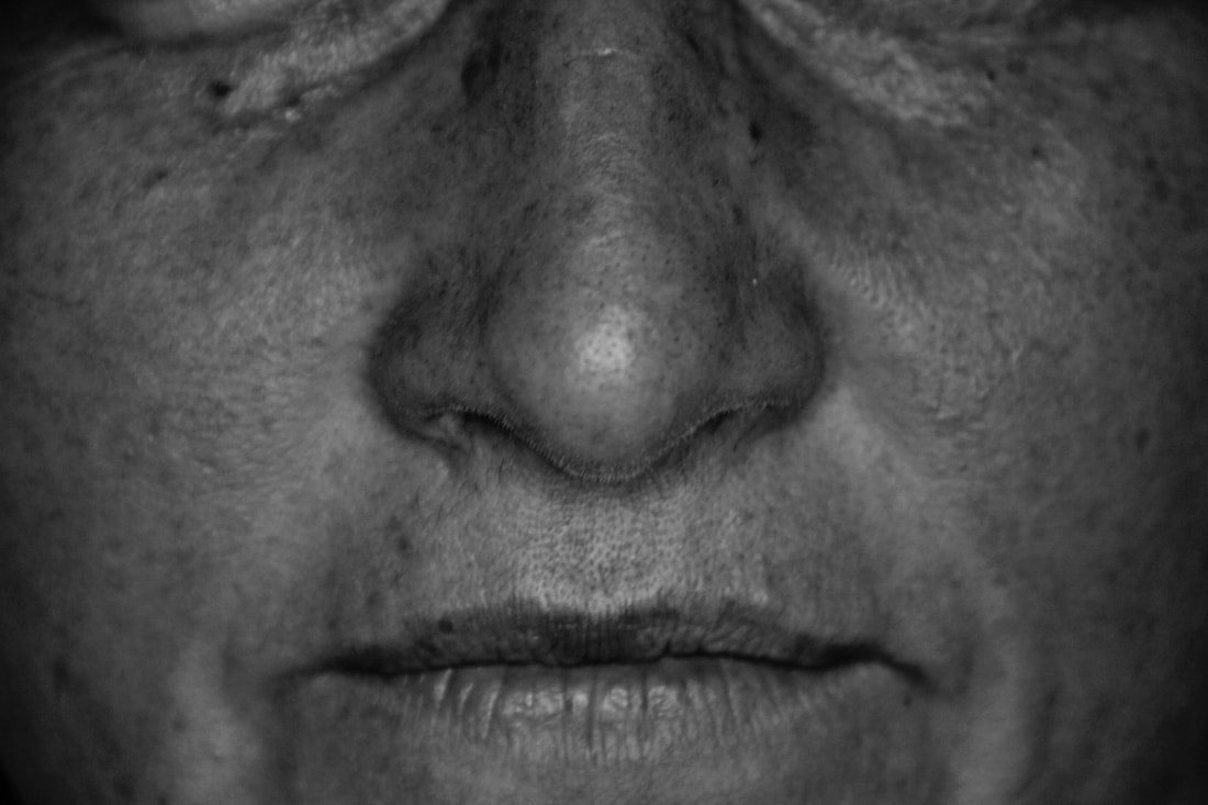
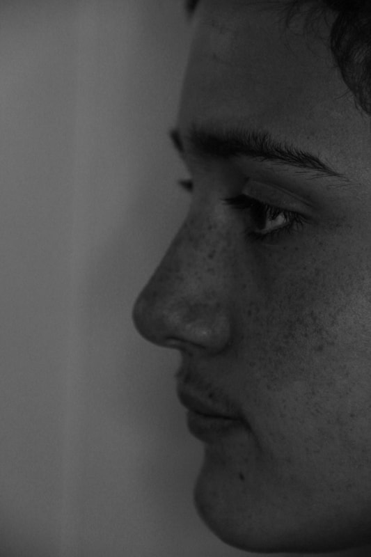
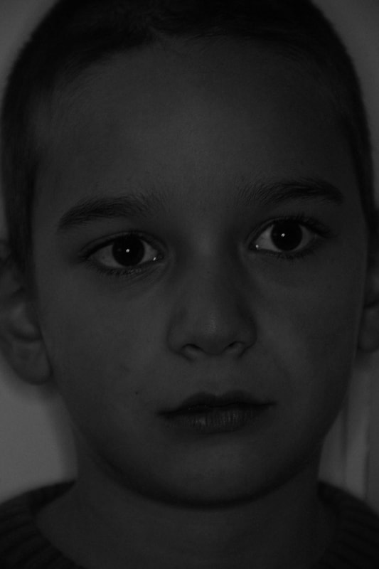
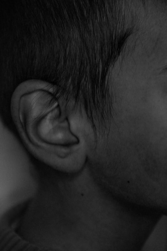
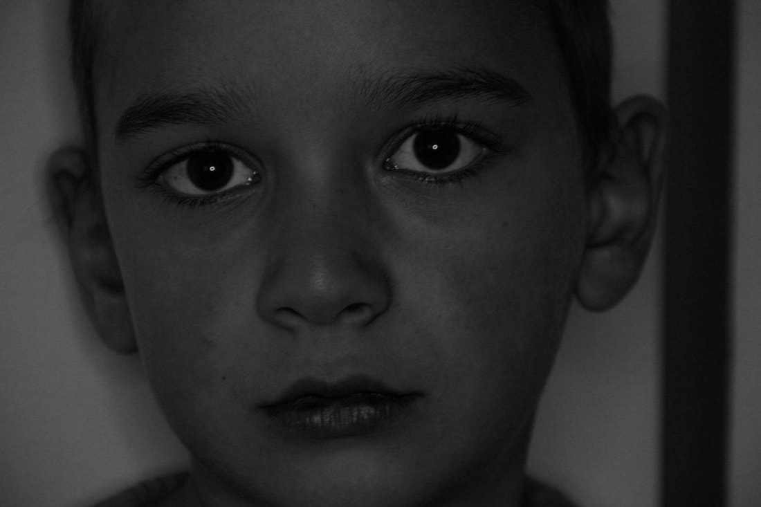
Myra Greene- Character Recognition.
|

|

|
2005.
She wanted to combine the process of ambrotypes with something that she was passionate about. This passion stemmed from the concerns that she had about race and identity. This was the basis if her work with character recognition. In august of that year, Hurricane Katrina hit New Orleans. After watching the news about hurricane Katrina, Greene was confronted with the idea of how people looked at and judged people of colour.
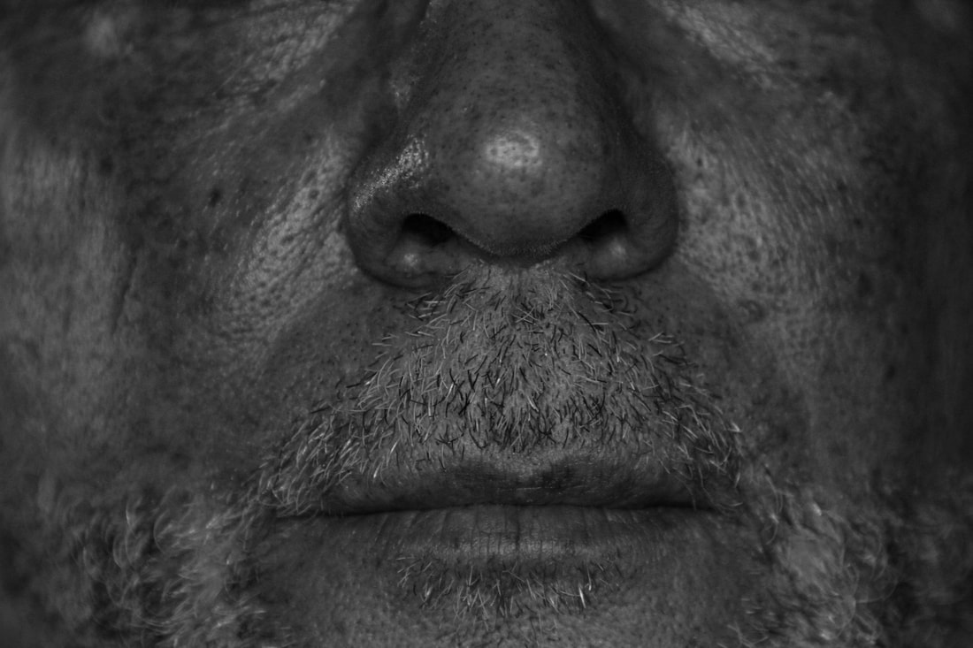
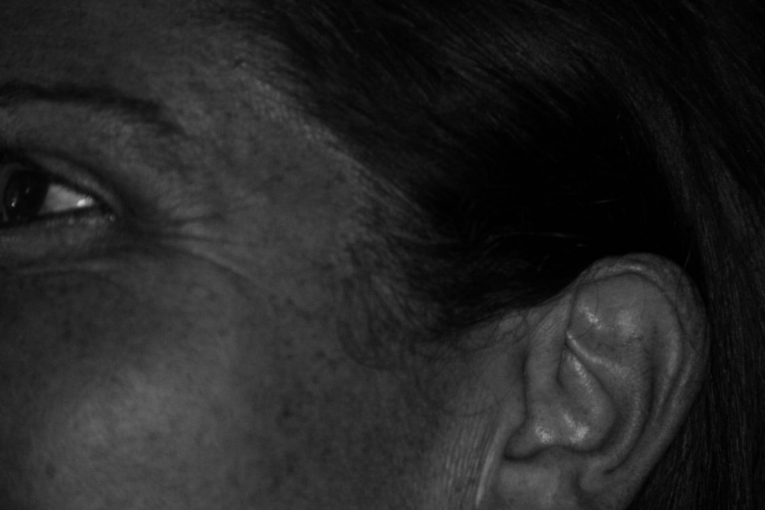
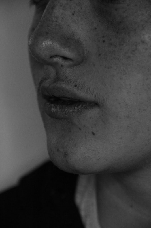
The concept of character recognition looks at the idea of mugshots and how we look at features of the face and merged it with the photographic process ambrotypes. She created a variety of facial features on twenty plates. This included the eye, the nose, the ear, the mouth and the profile.
The idea that Greene wanted to explore was that, with just the singular facial features presented, you begin to build ideas about identity and racial identity based on the appearance of the facial features.
The historical context her work is the emergence of the photography and the ambrotype in particular, with slavery at the time.
She aims to use this antique process to represent a contemporary look at race.
I find Myra Greene's work fascinating in the sense that you don't have to show the full face to portray the emotion that you wish to portray. When most portraits show a bigger image, normally a full face, Greene focuses solely on the different sensory component of our face, showing great depth and detail. She incorporates and uses to her advantage the smaller, more intricate details of our , lips, eyes, the nature of skin, our pores, blemishes, wrinkles and creates a form of art, something to be admired.
She wanted to combine the process of ambrotypes with something that she was passionate about. This passion stemmed from the concerns that she had about race and identity. This was the basis if her work with character recognition. In august of that year, Hurricane Katrina hit New Orleans. After watching the news about hurricane Katrina, Greene was confronted with the idea of how people looked at and judged people of colour.
The concept of character recognition looks at the idea of mugshots and how we look at features of the face and merged it with the photographic process ambrotypes. She created a variety of facial features on twenty plates. This included the eye, the nose, the ear, the mouth and the profile.
The idea that Greene wanted to explore was that, with just the singular facial features presented, you begin to build ideas about identity and racial identity based on the appearance of the facial features.
The historical context her work is the emergence of the photography and the ambrotype in particular, with slavery at the time.
She aims to use this antique process to represent a contemporary look at race.
I find Myra Greene's work fascinating in the sense that you don't have to show the full face to portray the emotion that you wish to portray. When most portraits show a bigger image, normally a full face, Greene focuses solely on the different sensory component of our face, showing great depth and detail. She incorporates and uses to her advantage the smaller, more intricate details of our , lips, eyes, the nature of skin, our pores, blemishes, wrinkles and creates a form of art, something to be admired.
Ambrotype.
|
An ambrotype, in short, is an early form of a photograph in which the photo is created by placing a glass negative against a dark background. Ambrotypes were introduced in the 1850’s and are commonly called ‘collodion positives’ because you are creating a positive photo on glass by a variant of the wet plate collodion process.
After the positive image is created, the dark background is put in place behind the image so that you can see all of the highlights, shadows, and details in the positive image. |

|
My photographs.
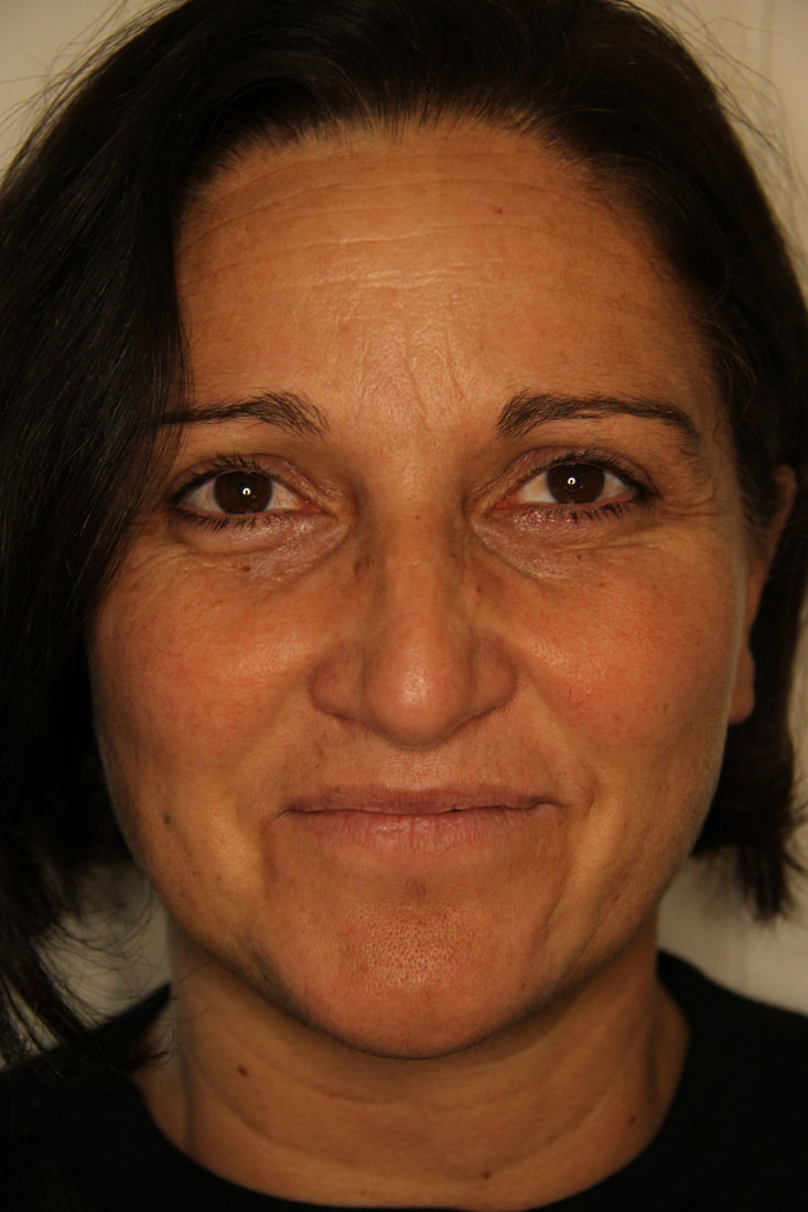
For this task we were required to use our camera to replicate Myra Greene's character recognition project where we had to capture different facial elements close up of different people. In this task i chose to use my family; my mum, dad and younger brother as it provided representations of both generations and different ages. I aimed to bring out the finer details of their faces, focusing on pores, wrinkles, blemishes, skin pigmentation etc. I found that this task was quite successful as I managed to capture the more intricate characteristics of the face. I enjoyed the monochromatic editing as it emphasises and brings out details more so they are more prominent. It also allows for the shadows to become darker and more intense and for the highlights to be brighter and shows more contrasts in the two which I find makes the overall image more captivating. To improve I could incorporate more people to get more of a variety of objects to photograph. Furthermore, I could've asked them to angle their heads in more angles to capture more parts of their faces.
|
|
|
|
|

|
|
My darkroom reproductions.

|

|

|

|

|

|
|

|

|

|

|
Evaluation.
The aim of this task was to use the final two images in our Myra Greene reproduction work to create darkroom replicates which will give our images more depth and create different effects with them. To do this, we used acetate sheets with the inverted colour form of our final chosen images which we then took into the darkroom to produce our developed and altered photograms. To create the lighter shapes around the photos we used masking tape and tracing paper. This created a more interesting effect and added different textures and tones to the photos. Moreover, we used the painting developer technique to add more interest to the photo and make it more exciting. I think that I was successful for the most part as my images came out clearly and my attempts with the effects was successful. I enjoyed the intense dark tones that were created in the darkroom as it really enhances the texture of the skin. To improve my work I could've experimented with other techniques and created more of a selection of photos.
Some good darkroom examples. Don't forget to annotate. You also get into a mess with the layout. Use slideshows or a gallery to organise your images.
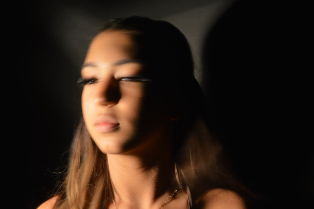
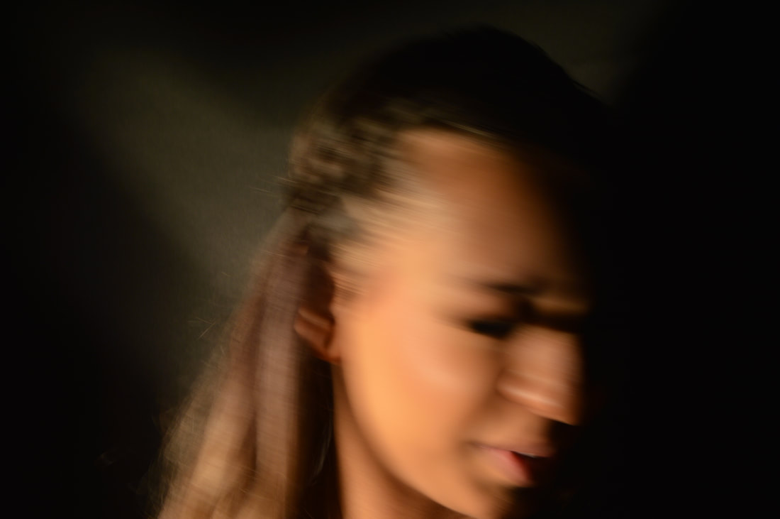
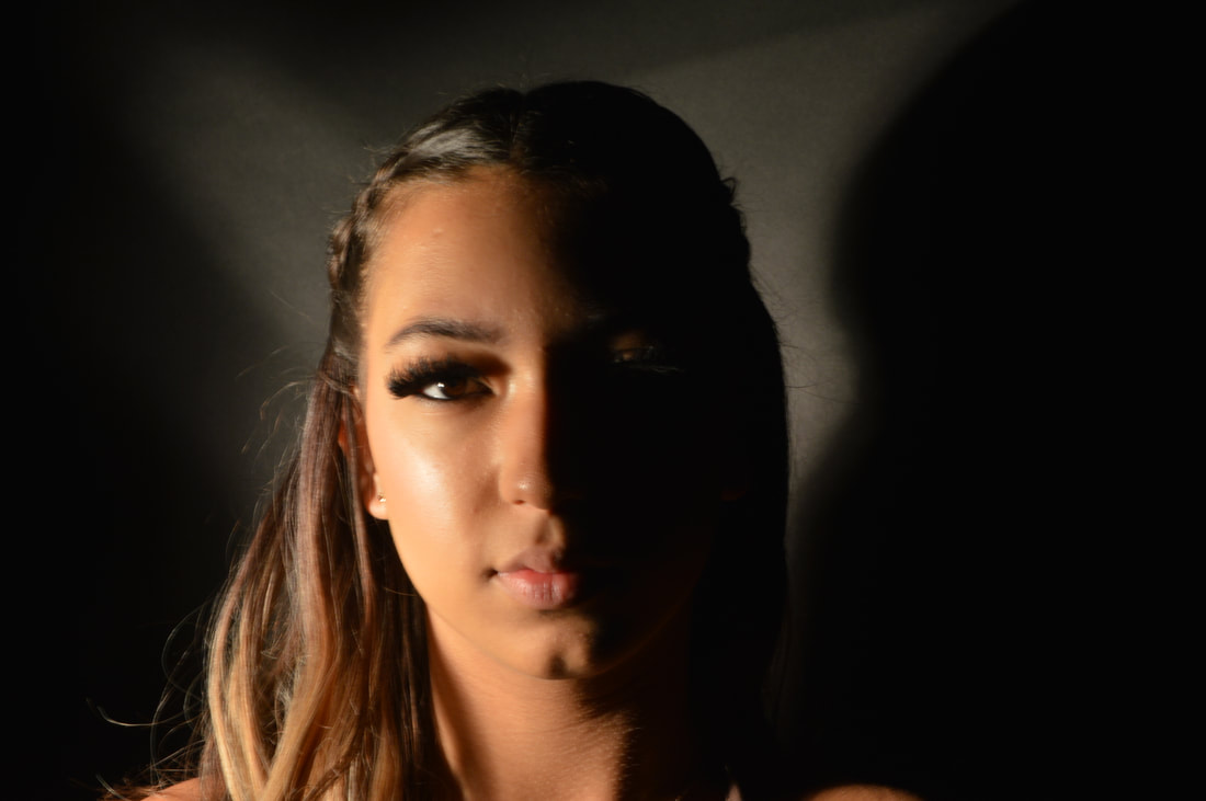
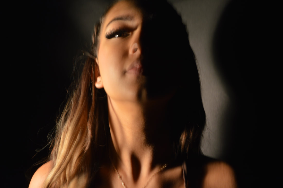
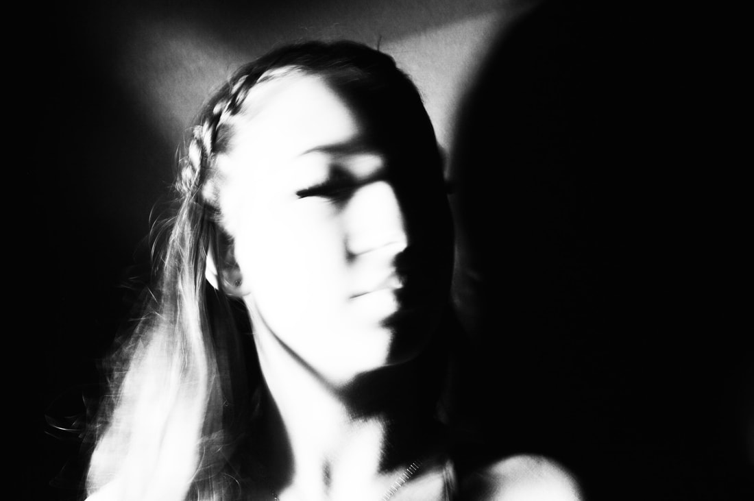
LIGHT AND SHADOW- VALERIE KABIS

Valerie Kabis's work looks at the extremes of the tonal ladder, emphasising the light and intensifying the dark and shadows. In her work, it is noticeable that she also experiments with the idea of movement and that blurred effect that movement creates in photography. I really enjoy Kabis's work because I think she manages to portray a lot of emotion with the composition, her subjects and the effect that she creates with the tones. I find that in a lot of her pieces there is a lot of depth and quite strong underlying emotions that can be easily distinguished by the viewer. For example, in the image above "the room singularity" there is quite a sense of isolation and solidarity which she's not only created with the spacing and the object of the photo but by really isolating the strong highlights of the woman and darkening the surrounding.
My images.
|
|
|

|


|


|

I think that my most successful images were the first three as I was able to create a similar movement effect that Valerie Kabis uses in her images. Furthermore, the lighting in those images were more successfully edited, increasing the light and the shadows to get the right composure. To improve I would look at other techniques to achieve the movement effect and try to get other angles and perspectives of my models instead of single portraits of the same distance. Also, I would avoid just taking the still images, like the ones in the middle, as the stationary images wont allow me to edit the images to the desired tones and they don't really capture what Kabis did in her work.
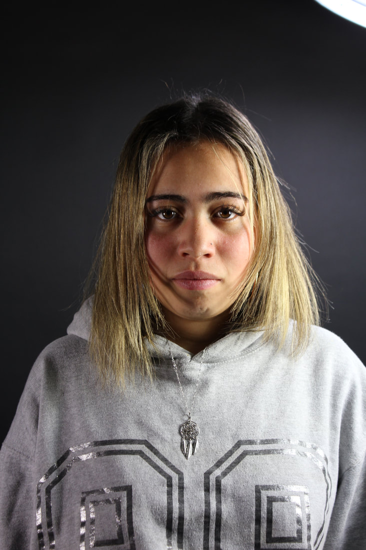
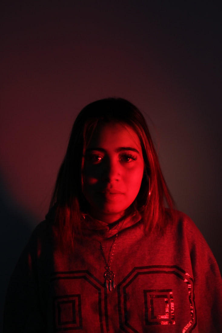
LIGHTING
In this task, we were required to take photos of someone and experiment with different lighting. In the first few images, we changed the positioning of the light we were using and then change the hue of the lighting we were using.

Place the Main light first
The light is placed at an angle facing the model. This will illuminate half of her face leaving a darker shadow on the other half. For basic portraits, shorter shadows are best and you'll get those by moving the light closer to the front of the subject's face rather than far off to one side. |

The fill light
This light is much less intense than the main as works to fill in some of the shadows that were created by the first singular light. |

Hair light
For this shot, another light is positioned behind and above the subject and pointed down to strike her hair. This light will illuminate the surface of the model's hair. |
|
|
EXTENSION
|
|
DOCUMENTARY PORTRAIT.
GEORGE TOWN- LEWIS KHAN
|
|
|
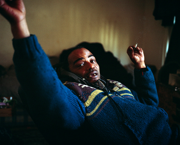
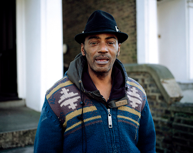
Lewis Khan is a photographic artist from London who works with stills and moving image. His portrait based work is a study of emotion, relationships, and identity. George Town is a projected done by Lewis Khan which is a view into the life of south London resident, George. This project gives an insight to the raw side of life; the casual everyday. Lewis and George had the relationship of passers-by that would often see each other on the street when Lewis went to play football as a teen. Georgetown is informed by six years of these impromptu and informal meetings in the street, usually the same one. The project looks at George's life including his life at home and what he does day to day. I really enjoy Lewis Khan's work as I find it really interesting and almost heartwarming to see such natural and raw emotion captures. For example, in this photo to the right, the candid joy of the image is uplifting and touching to look at. |

|
Portraits in school.
Canteen staffOffice staffDinner ladies |
LibrarianCaretaker |
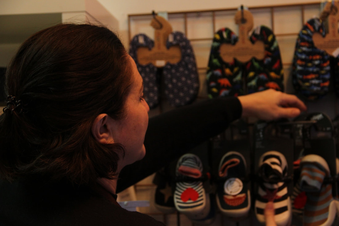
My home documentary portrait
I decided to take photos of my mum at work. My mum owns a shoe shop for kids called "Windmill" in Crouch End. This is considered her third child since she opened it in 2013. It is her pride and joy and I've recently started working there for her. It it such a welcoming, colourful, small shop and that is why I decided to follow her round and take photos of her. My mum owns the shop with her friend and they both decided to open it 7 years ago as my mum had a childminding background so she's always been around and looking after kids. Her co-owner Kirsty had quite a creative background and always loved fashion and putting her kids in shoes from all around the world. I think that this task was successful as i managed to get many different shots of her working, the shoes, the setting and lots of different perspectives. I really enjoy the photos in the stock room as I could get some longer distanced photos of her and also get photos of in between the shelves which created a cool effect. Furthermore, I enjoyed the photos from outside the shop as it includes a lot of the colours and vibrancy of the shop and it shows depth of field throughout my photos. I had to edit many of the photos to make them warmer as the stock room lighting was quite cold and harsh but I think they were successfully edited. We live in a small, quieter section of Crouch End so my mum was very happy that she could bring this colour and joy.
My most successful images.


|


|
Ben Watts
|
In this task we are looking at the British, contemporary photographer Ben Watts. Ben Watts was born in London and started his creative journey at the Sydney College of Arts. He started his photographic career in Australia as a photographers assistant but soon moved to taking on commissions of his own, shooting for Australian "Elle" and "Vogue".
|

|

|

|
His career really flourished when he moved to New York in 1990 where he worked with American hip hop culture. In his time in New York, he documented the urban youth and photographed streets capturing candid New York. He then moved to New York five years later and started his work shooting advertising campaigns such as Nike, Polo Ralph Lauren and The Gap.
The Big Up project
Big Up is a collection of portraits featuring rappers, actors, boxers, dancers, skateboarders, children, and other street characters. Ben Watts started this collection in 1990 when he came to New York to continue his career in photography. Fascinated by the faces and energy of New York’s urban youth culture, the book started as a collection of personal snapshots that continued to build over a dozen years. The photographs contain sharpie notes and tape alongside other mixed media that give the images a unique stylised look.
|

|
|
Ben Watts inspired work- Muhammed Ali.

|
This is a task we did in class where we were asked to create a collage based on Ben Watt's work, especially his work on his project "Big Up". Our focal point was the boxing sensation Muhammed Ali. Ben Watts, amongst many singers and actors, liked to work with and photograph boxers. We were given several different materials; masking tape, card, coloured paper, paint etc and had to arrange and creatively produce a collage of our own. We used many different images of him as well as quotes that had been printed out to incorporate within our collages. Firstly, as well as a focal image, I decided I wanted a focal colour to tie in with the images so I chose orange which I think worked well with the black and white images. I enjoy the center piece of my collage as I've isolated the bigger image of Muhammed Ali and positioned it to almost stick out of the page. Despite adding my own ideas, I believe Ben Watts did something similar isolating his focal points in several of his works.
|
My Ben Watts self collage.
|
For this task we had to create a piece inspired by Ben Watts' "Big Up" project. Similar to the previous task, we had to make a collage of several images and texts, however in this task, we had to make it personal to us by using photos of ourselves and photos we had taken that make up our identity and what its like to live in London in 2021. To make this personal to me, I started with the foundation colour of pink being my favourite colour. Then I layered some images of myself and my friends in settings hat have meanings to me; my secondary school, my local park and at home. As the central image, I used a photo of myself to build off of and then I wrote some important phrases around the images, as Ben Watts does, including my date of birth, the year we're in, my post code and some locations that have meaning. I also added a train ticket in the collage to show that I am able to remain integrated into society, despite the ongoing 2021 covid crisis, through my use of public transport as a teenager. I also liked how I made the smaller photos look like polaroids by giving them white outlines which is similar to Ben Watts.
|

|
Portraiture Interim Assessment
The analysis demonstrates a clear understanding of the work of others; discussing context, intentions and technique. Several personal insights. Your understanding extends to your practical work which appropriately draws upon each photographer's style or subject matter whilst adding a personal touch. (AO1)
Clear willingness to experiment with different techniques, lighting set ups, depth of field etc. You could push your responses even further and explore other outcomes to set tasks. You did this with the Valerie Kabis response, including movement in your images. (AO2)
Creative approach to most tasks, particularly the Selfie images.Your studio and posed work is stronger than the less formal photography (eg. Lewis Khan task). Several of your images do reveal enough about your subject as their face is concealed. The background also hasn't always been considered. You need to put yourself in the position that enables you to achieve the best composition. (AO3)
Portraiture Project.
Brief
In this project I am going to gather inspiration from Myra Greene's character recognition project and take some ideas from Ben Watts’ ‘Big Up’ project. I chose to borrow ideas from these two photographers as I really enjoyed their work and was fascinated by Myra Greene in particular, and I enjoyed reproducing both of their work the first-time round. I have chosen to focus on some of my other friends instead of family members this time to incorporate some other features and appearances to my work. With these close-up images, I plan to arrange them in a collage format similar to Ben Watts, still allowing the delicate details and properties of their faces to be the main focus. I intend to collage these manually to be able to use different materials to add to them. I intend to use people from more of a variety of different age groups this time to show more of a contrast between them.

My edited photos.

|

|
|

|

|
|
|
|
|

|

|

|
|

|
In this task I chose to use my younger cousins, Max (age 6) and Nico ( age 3) as well as my aunt. This project was very amusing and interesting to create as I was working with very little kids which proved difficult but also fun. I think the most difficult elements of the project was keeping to Myra Greene's techniques and style whilst still making it my own. Furthermore, keeping the kids still and looking at the camera in different positions was a challenge so it limited my ability to collect the most successful images. To improve, I could've attempted to get more close up and detailed images for the kids and zoom in on more of the intricacies of the skin and facial features. However, I did find my images of my aunt successful as they captured a high level of detail and as a result showed more of a contrast in lighting and spark more interest when you are looking at them.
My ideas.

The idea is that I would strip the images down side by side ( I would like to create this effect on my laptop however I still need to learn how to create the ripped effect) and create a Ben Watts style collage. I am planning on using inspiration from the photographers Lucas Simoes and Bobby Neel Adams

|
My inspirationI liked how this artist composed the three images and how each image is its own photograph but together they create a really interesting effect. I wanted to incorporate Myra Greene's work into this style because I think that the details in the face would look particularly eye-catching.
The initial concept of the image was very exciting as the intricate detail would've appeared very fascinating, however, personally I feel that the final outcome was not as impressive as I had envisioned mainly due to the fact that I edited on word document which didn't allow for very clean background removals and the images just didn't produce the effect I had hoped for. Nevertheless, without the rigid edges and straight lines, I think that the composition and the images used were successful. I enjoy how the images i chose almost showed movement as they are of different angles and different profiles. |

My inspiration.

|

|

|
My final copy.
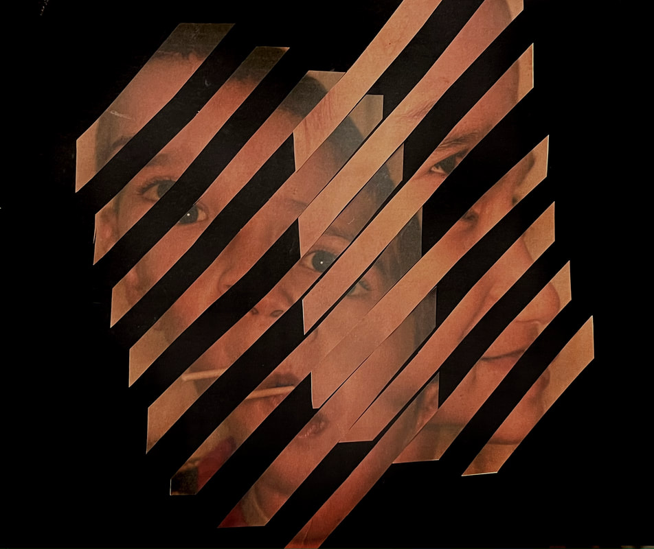
I was very intrigued by the concept of cutting up an image and then piecing it together to form the original image, making it just that bit more interesting. I have decided to combine cut ups of the two images of my cousins of two different images. I have placed them so that it is organised from youngest to oldest (left to right) so its almost shows time sequencing through the integration of the strips. I like how you are still able to make out the separate images but also appreciate the effect of them being positioned in that way. I also enjoy the use of a black background as I feel it provides more depth and enhances the focus of the main images without it being too confusing to look at. To improve I would've edited the original images to make them have less of an orange tinge which I had to fix after the piece was assembled. Furthermore, to produce a cleaner look I probably would've used a paper guillotine to create sharper strips.
